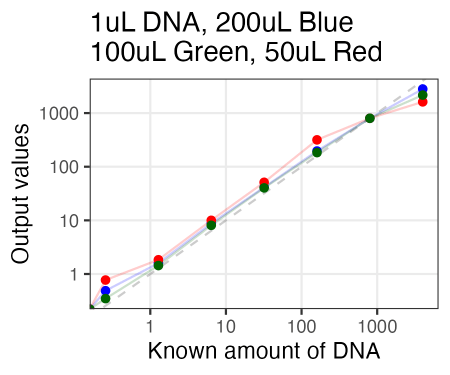
Submitted DNA amounts and reads returned

In this previous post, I showed how many reads we’ve gotten from our Plasmidsaurus and AMP-EZ submissions. Well, now’s also time to see whether the amount of DNA that we gave correlated with the number of reads we got back.

Submissions to Plasmidsaurus. Red vertical line denotes the minimum value asked for submission (>= 10uL at 30 ng/uL). Blue line is a linear model based on the datapoints.

As you can see above, since this is miniprepped DNA, it’s usually quite easy to reach the 300 ng needed for submission. One time, when we submitted closer to 200ng, it worked perfectly fine. One other time, when we submitted ~ 100ng, it did not, albeit this was not plasmid DNA and instead was a PCR product, so it’s an outlier for that reason as well.

Submissions to Genewiz / Azenta AMP-EZ. Red vertical line is the minimum amount of DNA asked for, while the horizontal red line is the number of reads they “guarantee” returned. Blue line is a linear model based on the data.

This is the more important graph though, since all of our AMP-EZ submissions are from gel extracted PCR amplifications, and it can be quite difficult to do it in such a way that we have the 500 ng of total qubitted DNA available for submission. Well, turns out that it’s probably not all that important for us to hit 500 ng of DNA, since it’s worked perfectly fine in our attempts between 200 and 500 ng. I imagine people in my lab will simultaneously be happy (knowing they don’t have to hit 500 ng) and sad (knowing they had spent a bunch of extra effort in the past unnecessarily trying to reach that number) seeing the above data, but hey, it’s good to finally know this and better late than never!

Flow cytometry compensation

So I tend to use fluorescent protein combinations that are not spectrally overlapping (eg. BFP, GFP, mCherry, miRFP670), so that circumvents the need for any compensation (at least on the flow cytometer configurations that we normally use). That being said, I apparently started using mScarlet-I in some of our vectors, and there is some bleedover into the green channel if it’s bright enough.

These cells only express mScarlet-I, and yet green signal is seen when red MFI values > 10^4… booo……

Well, that’s annoying, but the concept of compensation seems pretty straightforward to me, so I figure we can also do it post hoc if necessary. The idea here is to take the value of red fluorescence, multiply that value to a fraction (< 1) constant value representing the amount of bleedover that is happening into the second channel, and then subtracting this product from the original amount of green fluorescence to make the compensated green measurement.

To actually work with the data, I exported the above cell measurements shown in the Flowjo plot above as a csv and imported it into R. Very easy to execute the above formula, but how does one figure out the relevant constant value that should be used for this particular type of bleedover? Well, I wrote a for-loop testing values from 0.0010 to 0.1, and saw whether the adjusted values now resulted in a straight horizontal line with ~ zero slope (since then, regardless of red fluorescence, green fluorescence would be unchanged).

Now as that value becomes too large, then more will be subtracted than should be, resulting in an inverse relationship between red and green fluorescence. To make my life easier to find the best value, I took the absolute value of the resulting slope in the points, which pointed me to a value of 0.0046 as the minima, for mScarlet-I red fluorescence bleeding over into my green channel on this particular flow cytometer with these particular settings.

Great, so what does the data actually look like once I compensate for this bleedover? Well, with this control data, this is the before and after (on a random subset of 1000 datapoints)

Hurrah. Crisis averted. Assuming we now have sample with both actual green and red fluorescence (previously confounded by the red to green bleedover from mScarlet), we can presumably now analyze that data in peace.

Just for fun, here’s a couple of additional samples and their before and after this compensation is performed.

First, here are cells that express both EGFP and mScarlet-I at high levels. You can see that the compensation does almost nothing. This makes sense, since the bleedover is contributing such a small total percentage to the total green signal (EGFP itself is contributing most of the signal), that removing that small portion is almost imperceptible.
Here’s a sample that’s a far better example. Here, there’s a bunch of mScarlet-I positive cells (as well as some intermediates), and a smattering of lightly EGFP positive cells throughout. But aside from the shape of the mScarlet-I positive, GFP negative population changing from a 45-degree line to a circular cloud, the overall effects aren’t huge. Still, even that is useful though, b/c if one didn’t look at this scatterplot (and know about the concept of bleedover and compensation), one might interpret that slight uptick in green fluorescence in that aforementioned population as a real biologically meaningful difference.

Workday accounting

Rather facetiously got a suggestion to keep track of how my workdays are spent, but that did prompt me to start keeping track since I have gotten into the phase of my job where I’m feeling somewhat burdened by non-research responsibilities and I like having data in hand. As I’ve noted on my other website, my workdays are now largely constrained by daycare hours. Thus, I do have pretty limited hours in a day to get everything done, requiring a fair amount prioritization; doing one things often means not doing something else.

I’ll sporadically hit “run” on my analysis script and the below plot will update. The n values are currently pretty small, but I plan to keep doing this indefinitely.

Keys for the above plot:
Red dashes are mean values across all days. Gray dots are values for individual days.
Research_internal” denotes activities that directly impact my research group (eg. meetings with personnel, data analysis, benchwork).
Research_external” denotes research activities that don’t have to do with my group (eg. Science-centric meetings with other faculty, emails to people requesting reagents).
Administrative_internal” denotes general paperwork (eg. Filling out my annual performance reviews)
Seminar_director” denotes work related to running the immunology portion of the Dept seminar series (eg. More emails…)
Postdoc_affairs” denotes work related to trying to manage postdoc affairs for the dept (and in some ways, by extension, the SOM).
Other_service” denotes other service activities for the school (eg. Corresponding with CWRU undergrads not in my group).

But I can break down some of these activities further. For example, for the the “Research_internal” section where I’m handling things directly related to my research lab, it can be further broken down as follows:

Most of the categories here are self explanatory. “DNA_construct_stuff” is planning out primers or checking plasmid associated sequencing reads. “Labwork” is mostly tissue culture, since I think that’s where my direct efforts are most valuable (in contrast to using a DNA extraction kit, for example). “Literature” is either doing literature searches or reading papers.

And, well, since so much time seems to be spent writing emails nowadays, this how much time I spend writing emails each day (note: I do all internal communication with lab members via Slack, so this is mostly administrative matters):

Codon cheat sheet

Like many people, I have an amino acid / codon cheat sheet posted around my desk that I can look at whenever I need to quickly design a missense mutation into a construct, or get the sense of the relative size differences between two different amino acid side chains. Well, I recently scribbled on the one I had hanging on my desk from when I started, so I had to replace it. But, I took a little time to customize it with information I would find the most useful (eg. reminding me which amino acids were encoded by 6 codons instead of the usual 2 or 4, which is the most frequent codon per amino acid that isn’t ridiculously GC rich). It’s meant for double-sided printing.

Net University Funds

Kind of an interesting observation, so I figured I’d post it.

Now that I’ve been here a little while and have gotten some research grants funded, I was curious how my research group was faring from the University’s finances perspective. Now of course this is going to be a gross oversimplification, but I figured a simple metric was taking the amount of money the University has gotten as indirects from my research grants (61% indirects rate; you can figure this out through a simple Google search), and subtract that by the amount of startup funds I’ve spent so far (note: this isn’t all the startup funds I have available; just what I’ve spent so far and is thus officially “gone”). Well, here’s what that looks like over the last two years:

My first pass at trying to analyze this data was incorrect, since my budget reports only list the total money spent (which includes directs and indirects), so I had to go back and extrapolate the direct and indirect funds out of that number for each budget number (with there being three classes: startup accounts with no indirects, the K award with 8% indirects, and the R awards with 61% indirects). So in actuality, I have not yet accrued more indirects than startup funds expended, although I do know that for the last 6 months I’ve been funded 100% off my NIH grants (I haven’t been spending my startup at all), so presumably the trend will keep trending toward the positive.

11/9/23 update: Well, so the trend did continue until I reached dead even, although I’ve since started spending on my discretionary accounts because I’m tired of it just sitting there and losing value due to inflation. Now my short-term goal is to keep finding good ways to spend my discretionary funds to help the research projects in the lab while I get more space (been waiting for years…) so I can potentially hire more people and buy more equipment with remaining funds later…

Synthetic uORF construct

So I’ve long wanted finer control of protein abundance, and to date, have had the greatest success messing with the Kozak sequence to alter translation rate, thus modulating the amount of protein steady-state abundance. That said, I’ve wondered if there are other aspects that could be further manipulated to increase the dynamic range of the amount of protein steady-state abundance. This at some point led me to try playing around with upstream open reading frames (uORFs), that can interfere with the translation rate of the downstream protein (in my case, a green fluorescent reporter). We recently made a vector with one such uORF, so I looked at what effect having that uORF had on green fluorescence of the cells.

The actual vector plasmid name is “AttB_2xuORF_mGreenLantern-T2A-shBle-IRES-mCherry-P2A-PuroR”. As you can tell, red fluorescence is behind an IRES, and should be unaffected by the uORF. That’s indeed what we see, with the red distribution being a control construct without the uORF, and the blue distribution being the identical construct with a uORF immediately preceding mGreenLantern (Note: YL2-A is the fluorescence channel for red fluorescent emission).

Now if I gate on that bright red population, and look at the amount of green fluorscence, there is indeed a difference (BL1-A is the channel to look at for green fluorscence), although the effect isn’t huge. Looking at the distribution geometric means, it looks like the uORF construct is roughly 3.23-fold less bright than the control, so roughly a half-log less bright. Now the reason I’m underwhelmed is that I can get a roughly 1.5-fold difference in fluorescence using different Kozak sequences, so the uORF that I created doesn’t exhibit nearly the same magnitude of effect. Eh, that’s designing and testing constructs for you. That said, I suppose if I were to combine both, then I could likely get > 2 logs of dynamic range.

PS. Yes, I know there are simpler ways to modulate protein abundance, like transcriptionally through modulating the amount of expression. One day we’ll do more of that, but for now, translational control it’s been.

TC cell numbers

Every time I count cells, I not only write down the cell density (likely most relevant for the transfection i’m about to do), but I also write down the total volume of cells and the vessel the cells came from. Thus, I’ve essentially figured out how many total cells there were in the plate I was trypsinizing. I’ve mostly done this for T75 flasks, but I also have a handful of counts from 10cm plates as well:

So, in short, T75 flasks more or less max out around 20 million cells (hence the peak there, but the “confluent” flask), although I’ve gotten some larger counts before (maybe really packed in there, or maybe the result of counting error). 10cm, despite being slightly lower in surface area, has comparable counts, but that’s likely b/c I’ve tended to have consistently higher cell densities in there, since I’m usually doing end-point experiments in those and doing more routine passaging in T75s.

Common Plasmidsaurus Errors

OK, so we all know that Plasmidsaurus nanopore sequencing isn’t perfect. Every time I see the mistake at the 5′ end of the IRES sequence I know to ignore it, but there are bunch of other ones that I still repeatedly run into (but not quite as frequently) such that I don’t have it memorized and am not sure if I should be ignoring it right off the bat. Thus, I’m going to keep a list of repeated erroneous calls here on this page so I’m reminded to ignore them in the future.

Visual evidence of individual example listed below. But here’s a summary of Plasmidsaurus errors to ignore:

  1. IRES – deletions near the 5′ end
  2. mCherry – W63R or Q114R
  3. mScarlet – errors at R71 (sometimes R71G) and S113/L114 (including L114P).
  4. mKG – L96P
  5. Puromycin resistance gene PAC – R18G or L125P
  6. shBleR – Q56R
  7. Silent or frameshift mutations at the NPGP motif at the 3’end of the P2A sequence

In fact, be very suspicious of any unexpected L -> P mutant through Plasmidsaurus seq. And maybe Q -> R muts too.

Since almost all of my plasmids have this IRES sequence in it, I almost always run across this error (although it’s usually a 1nt miscall rather than 2nt like this example).
This Puromycin R18G error is annoying b/c it looks like it could be really problematic.
I don’t use mScarlet-I all that often, but when I do, Plasmidsaurus sometimes gives me this L114P erroneous call.
Here it gets screwed up in the same area but mysteriously called an A insertion, making it an S113fs.
It also has issues with mScarlet-I R71. Sometimes it calls it a silent mutation, but other times it calls it as R71G.
An insertion (which, if true, would make a frameshift) in the NPGP motif toward the 3’end of P2A.
Puro L125P
mCherry W63R
mCherry Q114R
mKG L96P
shBleR Q56R.

Edit 2/9/24: Here’s another one. A nt insertion in Asp residue at around position 4 or so of the histone 2A protein.

Cell surface FP brightness

When doing the Green FPs in HEK 293T cells experiment, we noticed how the same fluorescent protein, EGFP, could have vastly different brightness depending on the construct we were using.

Put another way, cytoplasmic EGFP gave us really high green fluorescence intensity, but a different construct wherein that same EGFP sequence was preceded by a signal sequence (thus causing it to become a secreted / extracellular protein), and succeeded by a transmembrane domain (thus causing the extracellular EGFP molecule to be anchored to the plasma membrane) gave us cells that were roughly 30 to 100-fold less bright. The amount of fluorescence of the transmembrane version was further susceptible to other sequence considerations; for example, addition of a his tag right after the signal sequence (such that the his tag is the most distal sequence on the protein, with the tag flapping around as part of a flexible N-terminus), resulted in a ~ 3-fold reduction in fluorescence as compared to an untagged version. My guess is that this repetitive, pseudo-charged region was interfering with efficient translation into the rough ER, but who knows.

Still, how do I explain this result? Well, I have no evidence-supported answer, but my guess is that it’s about translation process bandwidth and overall real-estate. I’m guessing that cytoplasmic translation and accumulation has pretty high bandwidth, where there are plenty of ribosomes to translate cytoplasmic protein, and there’s plenty of space to accommodate them. In contrast, I’m assuming there are comparatively fewer ribosomes capable of translating transmembrane proteins at the rough ER, and that the overall real-estate on cell-associated membranes (particularly in the vesicular pathway leading up to and including the plasma membrane) is also less (while an imperfect approximation, I’m thinking of it kind of like a difference in surface area or volume of a sphere, type of thing). Although who knows; maybe that’s all incorrect, and it’s more about the signal sequence (possibly from CD8?) and the transmembrane domaine sequence (seemingly from PDGFR-beta) that I used.

Edit 1: Although again, I need to keep reminding myself. Since these are cell surface proteins on adherent cells, some of the reduced signal with the transmembrane protein may be due to some proportion of proteins getting cleaved off the cells during routine trypsinization. I’ve talked to Olivia about trying a side-by-side experiment of resuspending the cells with trypsinization or Versene with gentle agitation. Stay tuned to see if I need to update the above plot or not!