Posters

So a couple of the trainees in the lab are preparing posters for the Dept retreat. In helping them (and other future trainees) get started, I dug out some of my own digital versions of posters out of the digital storage closet, and put them in a “Poster_examples” directory on the lab google drive. But along with those examples, here are a series of tips that I’ve learned over the years, which I’m remembering and committing to writing in this process.

  1. Be cognizant of the size of your poster. I think the most common dimensions are 36″ high by 48″ wide. For some conferences, they will allow you to make larger posters (probably depends on what type of poster boards they have). But also, different poster printers may have different dimensions. I’m sure most do 36″ or 48″ as one of their standard sizes, though you also want to figure out sizes your poster printer will do as one of its standard dimensions.
  2. Know how long it takes to print the poster. There are logistics to everything. Where are you going to get the poster printed? How far ahead of the guaranteed printing deadline do they need the submission? Again, it’s worth knowing this up front so you’re not scrambling at the end. Also, getting started a little bit early can definitely save you some misery later on.
  3. Plan for column-based viewing rather than rows. IMO, it makes much more sense to tell the story in a series of columns, where the viewer starts on the left of the poster, reads down the column, takes a step to their right, reads down the column, and so forth 3 or so times until they’ve seen the whole poster. Probably generally easier to read this way rather than horizontally through rows, and probably the ONLY way to see / go through a poster when it’s really crowded.
  4. Plan out how you’re going to talk about your poster as you’re making it. What normally happens in a poster session, is that you stand around all awkward and lonely in front of your poster until someone comes by that seems interested, and then you’ll introduce yourself and offer to explain it (and you can ask them who they are and what their background is so you can figure out what parts they may be particularly interested in or may struggle in understanding). Then you’ll explain this story, starting at the top left of your poster and winding down to the bottom right. Now, what would really help in telling this story is if the things on your poster actually illustrates what you’re trying to say. So, think about what exactly is the story you’re saying as you’re making the poster, so it’s all there when you need it.
  5. Always start by presenting the problem. It’s easy to get sucked into just saying what you’ve did. But nobody is going to understand why you did something until you tell them WHY you’re doing it. Which means there must be a problem presented, and your data is part of the solution in answering it. But if you want people to be on board, you definitely want to spell out the problem, and why it’s so important, up front.
  6. Do a light (white) background. The backing paper is going to be white. So why force them to cover the entire surface of the paper with ink?
  7. Consistency in fonts / font sizes. This is one of the hard ones. If you’re essentially making a scrapbook of different figures from different sources, it may be hard to get all of the fonts from the figures. In those cases, you may need to crop out the existing labels / text and add in your own of known / controllable size. Also, this is a good reason to always use the same fonts (eg. Arial) in all of your figures.
  8. Text size hierarchy. I hadn’t really thought about this before, but I think this makes sense: For the main text of the poster, it probably makes sense to have about 2 different text sizes: one for the main narrative text you may want the reader to read, and a smaller size for text that holds some detailed information (like a figure legend). The larger one is always meant to be read, while the smaller one is only to be read when necessary. The larger one should be able to be read a good couple feet away, so it’s definitely gotta be >= size 20 or something. Headers / section titles may also make sense too, and you can denote those using bold or by using a slightly larger text size. Of course, this is all not counting the poster title, which should be large and visible from across the room. Of course, you don’t want to overcomplicate things by having like 5 different font sizes.
  9. Not stretching / squishing figures. Nobody likes seeing images in weird proportions; sure, maybe it works with mirrors in a circus funhouse, but it definitely doesn’t work for conveying scientific information in a professional setting. So ya, make sure that if you’re adjusting a figure’s size, that you have the “height and width proportionality” box checked as you do it.
  10. Avoid having too much text. Nobody is at the poster to read the next great American novel. You’ll literally want the bare bones amount of text that you need to give just about all of the big structural information you need to. Everything else, like all of the details, you can convey in person.
  11. Don’t make it too crowded. Again, you want it to be inviting and easy to follow, so you want to give figures ample space to breathe. I’d also say don’t make it too sparse, but while it’s technically possible, I can’t imagine any serious poster has ever had that be an issue (eg. too much stuff to want to get in there).
  12. Consider expanding your illustrative palette. If you’re on your first few posters, it totally makes sense to use Powerpoint (or equivalent) to create your poster. That said, eventually, you may want to include other options. I’ve slowly shifted to using Inkscape, but partially since I’m much better / faster in Inkscape now than I am in Powerpoint. Also, BioRender is a great option for making some really aesthetically pleasing images / graphics relatively quickly with an easy-to-use interface. At worst, I suggest you generate some plots there, and just take screenshots that you can insert into your posters made in Powerpoint.

Also, I realize some of my own posters probably break some of these rules (eg. the “Avoid having too much text” rule). Nobody’s perfect!

Addendum:

Nisha just did the legwork on figuring out how we print posters here, and this is what she found out:
– FedEx office in Thwing (9am-5pm Monday thru Friday).
– General size that they work with is 36″x48″ , so that might be what you want your poster size to be.
– You can have it on a usb drive, or email it to them directly at [email protected]
– If submitted early enough in the day, they may be able to do same day turnaround, but better to submit 2 to 3 days before you need it just in case.
– Will update this once we know how payment works exactly, but I suggest showing up knowing one of the lab speedtypes to charge directly to one of them (R35 is a good candidate, but can always use the startup speedtype if needed).

Inverse PCR SSM Primer Python Script

Time to make our first concerted effort in making a small site-saturation mutagenesis library. Last time I did this in any deliberate way was with the PTEN library. We used the original Jain et al protocol for doing this with inverse PCR followed by DNA phosphorylation and ligation. One of the first Python scripts I ever really wrote (back in 2016) was to generate the list of primers we needed to order to make this library. You can find the script here.

Running it should be pretty easy: If on a mac, you literally have to open “Terminal” or an equivalent Bash terminal, go to the directory with the script and write “Python 160421_PTEN_SSM_30mer.py”.

Now, if you’ve never run a script for bioinformatic -type things before, then you may not already have biopython installed. In that case, trying to run it will likely throw an error. If that’s the case, I suggest you follow the directions here to install biopython (potentially in a virtual environment). Obviously, you aren’t going to want to make SSM primers for making a PTEN library like in the script, and will instead want to make primers for making a SSM of your gene of interest in a different plasmid (ie. with different sequences flanking your gene of interest). You can literally make those changes to the script by opening the “.py” file with a basic text editor (like TextEdit), or you can use a slightly more souped up text editor like “Sublime Text”. Or you want a slightly more complicated but perhaps better long-term experience, you can install Spyder or PyCharm and make the changes in an Integrated Development Environment (IDE). Either way, you’ll want to replace the pretty self-explanatory PTEN-library specific sequences that are currently written into the script.

Some additional considerations:
1. As I noted, this is for a ligation-based inverse PCR protocol. For all future libraries in the lab, I suggest we take a Gibson / In Vitro Assembly -compatible format, where instead of a blunt ended ligation product, the primers will create a DNA product with ~18 nucleotides of homologous sequence on the ends. Instead of writing this script myself, I’m leaving it up to future students to make that script by modifying my above script. Once we create this, I’ll perhaps post it here.
2. Once we come up with the list of primers, we can order them as machine-mixed primers from IDT (and not ThermoFisher, like our standard primer orders), since I’ve recently discovered that degenerate oligos from ThermoFisher have a pretty problematic T-bias.

NSF GRFP at CWRU

One of the hardest things to navigate at an institution are the convoluted layers of policies and administration. It’s still hard for me now as faculty, and must be exponentially harder as a trainee.

For any CWRU students in School of Medicine labs / departments planning to submit an NSF GRFP application, please know that you can apply for the fellowship directly, and don’t need to have to go through the grants administration associated with your department (reporting to the central grants administration team at the SOM level). You likely won’t be in the internal grants management system yet, adding additional (inexplicable) delays and hurdles, that may put your application past the internal deadline for grant submissions. Once past the internal deadline (and thus being locked out of being able to submit the application), you may have to write a petition to yet another group / committee, who may not see the forest through the trees and deny your request to no longer be locked out, effectively ruining all chances of submitting the application, even if you’ve already completely written it many days prior and the actual deadline for NSF is still a couple of days away. Only to have your PI eventually contact the School of Graduate Studies, which sets the entire SOM grants infrastructure straight by pointing out to them that the student applies for the fellowship directly, and all of those previous hurdles were inflicted on you solely by the school for no reason / by mistake.

If anyone seems unsure about this, I can always provide the receipts. If any of that is unclear, feel free to reach to schedule a time to chat. After I regale you with the full tale, I can also give my thoughts on the NSF GRFP, and the fact that even if chances of getting it are low, it could certainly still be worth trying to apply for the experience, and answer any other questions you may have about it.

Using Inkscape

Vector graphics editor software are SUPER useful when trying to make figures. A proprietary program some people may be used to is Adobe Illustrator. I’ve never actually used it, mostly b/c I started using playing around with vector graphics editor software when I was a grad student, and the idea of paying for an Adobe product with my own money was unpalatable. Inkscape is a free & open source software that works on Mac or Windows. It can be a little buggy, but I’ve learned to absolutely love it over the last 10 years or so. To help people in my lab start using it, I’m writing up this primer describing a series of basic processes I perform when using it.

Step 1: Downloading Inkscape. Obviously, this is downloading the program. I’ll assume this is pretty self-explanatory unless someone tells me otherwise.

Step 2: Starting up the program. You should get a blank screen like this, which is the basic workspace. The white rectangle with the drop-shadow is the blank “page”.

Step 3: Adjusting the properties of your page. While you don’t have to start here, I like to make some basic adjustments to the page out of the get-go. To do this, go to File -> Document Properties… or just hit “Command + Shift + D” if you’re on a Mac, like me. A new pane should open up to the right of the program, like below (if it doesn’t, try adjusting the size of your window and that should force a refresh).

The main things I like to change are as follows:
1) The dimensions. Most journal have maximum figure widths between 174 and 180 mm (though handful allow 190 or even 200 mm). It’s probably easier to plan for the smallest size of 174 mm, and just space things apart a bit / give the panels more breathing room if you end up in a situation where larger dimensions are allowed. Thus, adjust the width to 174 mm, and hit enter, and the width of that page should now shrink.
2) So the page settings defaults to *NO* background color (this can be revealed by clicking on that “Checkerboard background” button). So if you put in some shapes / plots, they will be floating in emptiness, rather than a white background. While this isn’t problematic per-se, it usually makes sense to make figures that actually have a white background. Thus, I next click on that box next to the text that says “Background color:” and in the bottom field that has a 0 next to “A:”, I change that to 100 (I’m assuming this is opacity, and we are turning the opacity from 0 to 100). This will make the background white.

Step 3: Saving the file. Now that you’ve made some modifications to your file, you may as well save it (since you’re going to want to start saving the file soon anyway). Go to File -> Save As… and save the file in whatever directory you want to keep it. The file type is will save is a “.svg” file, apparently for an “Inkscape svg” file, which is seemingly a slight derivation of a pretty genetic / standard file type for vector graphics (svg). You can just keep these default settings.

Step 4: Import some existing vector graphics data. So while you can start from scratch making shapes in the program itself, I’m most often using Inkscape to make adjustments to vector graphics plots generated in another program, like R. In this case, I’ll be importing a phylogenetic tree based on the spike protein receptor binding domain sequences from various coronaviruses. Thus, go to File -> Import… or hit “Command + I”, or press that arrow-point-to-a-page button at the top of the screen, to prompt the import screen,.

In the ensuing screen, point to the file you’re trying to import. If it’s a vector graphics -compatible file, then this will most likely be a “.pdf” type file. After you select a file, you’ll get a screen like this:

You can probably just click “OK”, since I’ve found these default settings to generally work fine. All of the shapes will all get imported fine, though I’ve found that the text gets imported kind of weird. Like, the letters are fine if you don’t make any adjustments, but if you try to rewrite any of the letters, you’ll notice that the spacing gets all screwed up. I usually just get around that by replacing the imported text with replacement text that I’ve created using Inkscape, though that gets a bit tedious. I suppose maybe one day I’ll learn if there is a better way to import text from a PDF, but for now, this will do.

Step 5: Adjust the positions and sizes of things. Depending on the dimensions of your image as it was outputted by the preceding program (like R), your image may or may not fit well within your blank page. In my case here, the image was indeed roughly the right size, though I wanted to zoom in a bit to see it in a bit more detail. To do this, I pressed the “+” button my keyboard a couple of times to get to the desired zoom, though you can adjust the Zoom in more detail on the bottom right of the screen (see below):

Another thing you may want to do is adjust the size and position of the image / plot you just imported. If you want to keep everything in the right dimensions, the first thing you’ll want to do is click on the “lock” button making sure the height and width stay in proportion.

Then you can type in whatever number you want into either the W: or H: fields, hit enter, and see if the size was adjusted to what you’d like. Another thing that’s useful is to adjust the position of the image. For example, perhaps this is the first panel of your figure, and you want it in the top left of the page. If that’s the case, enter 0 for both the X: and Y: fields, and hit enter (In many cases, you’ll want at least a couple pixels worth of blank space around the borders, in which case typing in something like 2 is better, but I’m using 0 today to prove a later point). Now the plot should look like so:

Step 6: Ungrouping and adjusting vector objects. As you can see, the border is now missing. Why is that? Well, it’s because in this case, the phylogenetic tree pdf I imported also had a white background, so that white background is now obstructing the borders of the page under it. While this isn’t necessarily problematic, this extra white background is superfluous and may complicate things downstream, so we will now get rid of it. To do so, click on the object, and go to Object -> Ungroup, or just hit the “Command + U” keys like I do. That one object should now have been turned into a bunch of objects, each with its own highlighting, showing that the ungroup command worked.

Unselect everything, and then select only the white background. Once you seem to have selected it, hit delete. If you missed and you deleted the wrong thing, you can undo. If you’re having a hard time selecting the white background because there is something in the foreground that inevitably gets selected first, you can take that foreground element and then hit the “send to back” button at the top of the screen to get that foreground element out of the way.

Once you do that, you should be able to more easily select the background element and hit delete. (In this case, there were apparently two background elements I had to individually select and delete). The end result should now look like this, where you can now see the Inkscape “page” borders again.

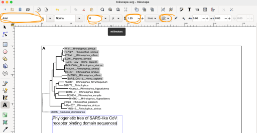
Step 7: Adjusting individual elements. In this case, there’s a lot of wasted space because the lines for the outgroup (MERS) is so long. This is also kind of pointless wasted space, since I’m not going to try to make any point about how similar the MERS RBD sequencer is to the rest of them… I’m just using MERS as a “outlier” sample to orient everything else with. To fix this waste of space, I can adjust the lines leading to MERS (the power of vector graphics editors!). To do this, click on the line in question. I did that, and noticed all of the lines in the image were still getting selected. Thus, I hit “ungroup” a few more times until EACH of the individual lines were selectable. I then selected the two lines I wanted to reduce in length: the one leading to the MERS outgroup, and the one leading to the tree. Once you do that, hit the “Edit paths by node” button that’s toward the top left of the screen (see the orange highlight below):

Once you do that, the start and end points of each of those lines are now selectable. Since I want to adjust both lines on the left size (and make it smaller by moving them to the right), click on one of those points, and then Shift-Click on the other point. If they’re both selected, they should look different from the points on the right side of the line.

Once they’re selected, you can move them to the right. I like to do fine manipulating at this scale using the arrow keys on the keyboard. So, I *could* hit the right arrow to move those nodes to the right and thus shortening the lines. Then again, I’d probably have to hit that button ~ 100 times to move it to the right the amount I want. That’s b/c by default, the arrows are “fine” adjustments. To turn the arrows into “coarse” adjustments, hold down the shift key as you press the arrow buttons. I only had to hit “Shift + [Right Arrow]” four times to get those lines to the length I wanted them.

That worked well, but now that connecting line is orphaned and confusing. We can now move that to the right by selecting that, and since we’re not selecting individual nodes but just moving the entire line itself, we can hit “Shift + [Right Arrow]” four times *without* first hitting that “Edit paths by nodes” button. If you already have the “Edit paths by nodes” button enabled (and thus shaded gray), you may need to turn it into the other “Select and transform objects” mode by clicking on the button above the “Edit paths by nodes” button. I’m also now moving everything to the left by selecting everything and entering X: 1 and Y: 1 as I mentioned above. It should now look like so:

Progress! Though adjusting the tree like we did can be disingenuous, since both the adjust lines we shorted (for the outgroup) is the same color & texture as the lines we didn’t adjust (for the rest of the tree). To distinguish between the two, we can click on the lines leading to the outgroup and change its style / texture to a dotted or interval one. That way, we can write in the figure legend later on that the dotted lines leading to the outgroup were adjusted to conserve figure space. To do this, click on the lines in question (holding down shift while doing so, so that all four individual lines can be selected), and then hit the color / button associated with the “Stroke:” label at the very bottom-left of your screen (see orange highlighted circle in the image below). This should open up a new page to the right. If you still have the “Document Properties” pane open from before, you may need to close it out (by hitting the “X” button at the top right of that pane), or just scroll down until you get to the “Fill and Stroke” pane. Apparently one can also get to this pane by hitting “Command + Shift + F”.

While you still have those lines selected, you can click on the tab that says “Stroke style” and then go to the button that says Dashes, and click on a style that has dots or dashes. You may also need to adjust the width of the line, so that it’s a bit more pronounced (I set it to 1 pixel).

The end result should look like this. A much better use of space!

Since this is potentially panel A, let’s make a panel label. To do this, click on the button labeled with “A” on the left side (the “Create and edit text objects” button), and then *drag* a text box roughly in the right area of where you’ll want it. Note: While you can *click* and make a test object, dragging is better because then you can modify the size of that text object later (less relevant for things like figure labels, but *definitely* important for things like figure legends). In this case, I typed in the letter “A”, turned it into bold. Once I did that, I clicked on the now bolded A, and then adjusted the X: and Y: to 1 so it’s now in the top left corner, like so:

Step 8: Aligning some object together. OK, well this figure doesn’t actually need this label, but let’s pretend we want to make a short one-line label / title at the bottom, and we want it right at the center of the tree. Make a text box like before, and type in your label. If you select the text box and are in text editing mode (you may need to click on the “A” button on the left again), you have the option to change fonts, bold / italics, size, line spacing, and line justification / centering in a series of boxes at the top. The one I adjust ALL the time is the line spacing. It defaults to 1.25, but it’s kind of waste of space like that, so I set it to 1.

Once you’ve done all that, you should have a screen that looks like below:

Now for centering the label right in the middle of the tree. To do this, select all of the tree elements (I would click and drag the selection around the tree). If it gets too many things, like the “A” panel label at the top left, do a “Shift + [Click]” to unselect just that. Then you can group all of the tree stuff together for easy manipulation by going to Object -> Group or hitting “Command + G” like me. To now align the figure label in the center of the tree, open the alignment pane. You can get to it by going to Object -> Align and Distribute… , or by hitting “Command + Shift + A” like I normally do.

This pane will allow you to align things based on the right edge, left edge, the center. Or if you have multiple objects that you want to space equally, you can go to the Distribute button options in the middle. Looks like it’s defaulted to “Relative to: Last selected”. That means that if you’re aligning two objects, the object you select first will be moved to the objected you selected second. You can of course change that order if you change the “Relative to:” to “First selected”. But in this case, I’m leaving it as the default, so I first selected the legend, and then selected the tree, and then hit the “Center by Vertical Axis” button that I highlighted in orange. The resulting image looks like this, where now the elements are aligned!

Step 9: Exporting your image. OK, so I’ve done everything I’ve wanted to do for this tutorial, so that last thing will be exporting the image. You have two options here. You can make a PDF that can be imported into whatever program later, by going to File -> Save As… and then instead of saving it as a .svg file, saving it as a .pdf file. (Note: this will change the workspace you’re working in to be a “.pdf”. If you want to have the workspace be an “.svg”, you’ll need to resave into that format. Or if you don’t want to do this roundabout process, you can also do File -> Print, and then select “Print to File”; all this is up to you). But, let’s pretend you want to actually submit this as a figure for a manuscript submission. Usually the desired filetype is as an image file rather than a vector graphic. This means something like an uncompressed .tif or .png file (instead of a compressed .jpg file). To do this, click on File -> Export PNG Image… , or click on the “Arrow coming out of page” button next to the import button at the top of the screen. This will open up another pane to the right:

For novices, I suggest you always click on “Page” for the Export area; this means it will export that full canvas you have been looking at (with the full width of 174 mm or whatever you had set before), rather than just the selected object, etc. You can adjust the dots per inch or DPI, but the default 300 is usually pretty good. And of course, you can and should change where the file is being saved. Once you do that, hit the “Export” button on the bottom. A little pop-up screen will show the export process (should be relatively quick for files like this). And Voila! You’ve made yourself a nice little customized image!

Update 1: Now with Western Blots.
I told myself that I would document the next time I was going to insert some image files into Inkscape for the purposes of this post, and here we are. So let’s now set the scene:

OK, so we have a multi-panel figure in the works here. The only panel relevant to today’s post is panel B, which is going to be a couple of Western Blotting images. In short, we have a negative control lysate, as well as 5 experimental samples where a different protein has been HA-tagged in each lysate. Looks like the first 3 proteins express quite highly, while the last two are expressed at pretty low levels. Thus, I’m going to try putting a lighter exposure image on the left side, and probably a cropped right portion of a longer exposure image showing the last few samples to the right.

Well, first thing to do is press that import button (circled in orange) at the top of the page. Doing that will open up a window like below, where you’ll want to select the image you want to import into your canvas.

Once you choose a file, you should get another screen like the one below. Default settings are fine in my experience, so you can just hit “OK”.

Do this for all of the images you may want. The image files, if they are of pretty normal quality, will be imported as HUGE dimensions on the canvas. Reduce the dimensions of the file to something more reasonable, like 150 pixels. You’ll see yourself in a situation like this:

Now to start aligning the images, the main trick you’ll to using today is “setting a clip”. In other words, instead of cropping the edges off of an image like one would normally do in Powerpoint, you instead make an area that you save from being cropped. Thus, to do this, I start by making a partially transparent box above the relevant bands, like these actin bands here.

I have multiple exposures I’m eventually going to want to line up on top of each other, so now that I’ve the box to be the size I want, I’m first going to make a duplicate of the box by hitting command D. I then move that duplicated box elsewhere on the canvas, so we can get back to it later.

Then, select both the box and the image (note: the box needs to be “above” the blot image), and then right click and hit “Set Clip”.

Doing so reduces the bottom image to the size of the top object. So now it’s the Blot image that has effectively been cropped.

Well, so I didn’t do a great job centering this crop, so I went back and fixed it but didn’t bother to retake the images. But if you’re curious, you can actually do this by right clicking on the object and hitting “Release Clip” to turn them into two separate objects again. Then just resize the box, select everything again, and then right click and hit “Set Clip” again.

Alright; now we can get one of the other exposures cropped and lined up. So now, I’ve moved in one of the other exposures in proximity to the red box. Since I’m going to have to make a larger field of view for this cropping, how straight the image is lined up is going to matter a lot more. For that reason, I drew in a black vertical line to visually inspect how straight it all seems. For the most part looks pretty good.

Allright, so I don’t need that line anymore so I went ahead and deleted it. But as I had mentioned; I want to get a larger window of the blot as compared to actin (a single horizontal band). Thus, I want to keep the width of the box the same but change the height of the box. To do this, click on the image, and you’ll see it have these arrows coming out of it.

Well, just click on the top and bottom arrows and drag to the height that you want it. It should now look something like this.

I can then crop and get the most relevant part of the image. Now that I have the cropped image, I can now align the two images together.

Now move everything in place. If you have another image, like a darker exposure, then you can just go back and repeat some of the previous steps for that one. You can even give them an outline, by duplicating the image, releasing the clip, deleting the repeated image, but turning hte red box into a completely clear box with a solid stroke; essentially, turning it into a see-through frame. Anyway, at this point, you should have a plot like above.

Next, making a bunch of labels to denote what each sample is. You can do that by dragging a text box, and then typing in your label. Once you’ve written the text you want for the first columns, duplicate that text box and replace the existing text with the text for the next sample, and keep doing this until everything is correctly labeled. When trying to make row labels, you may encounter needing to get some special greek characters like I did. In that case, while in the text box, go to Text -> Unicode Characters… and select it (see below).

You’ll get a box that looks like below, where you’ll want to click and select “Greek and Coptic”.

End result after you finish fixing the text should look like so:

Last bit is adding in the size labels, at least for the blot in the middle, since it spans a pretty large size. Alright, well, how would I go about doing this? Well, it’s pretty easy for the imager that we use, since it seems to spit out a combined image of the marker and the exposure, into a file that looks like this when imported into Inkscape (and resized to be the same dimensions of the lower exposure blot from earlier, and aligned on the vertical axis); here they are side-by-side.

If you want to prove to yourself that they are perfectly aligned, you can click both the actual lower exposure image and the marker-exposure overlay image, align them on both the vertical and horizontal axis, and then toggle the order back and forth (make the top image the bottom, and them make the bottom image top, etc). I did this, and they indeed seem to be perfectly aligned / superimposable (as one would expect). So knowing this, I’ll move forward by leaving tick marks where each of those marker labels are. Looks like the ladder we used is this one from GenScript.

Cool, now I can delete the overlaid picture, reset the clip on the original low exposure image, and then move the marker labels to a convenient spot to the left. Voila! (see below).


Additional resources:
I haven’t vetted this tutorial page, but it looks like it could potentially be useful.

Simulating Sampling during Recombination

Once in a while, someone will ask me how many cells they will need to be recombine to get full coverage of their variant library. And I always tell them that they should just simulate it for their specific situation. I essentially refuse to give a “[some number] -fold coverage of the total number of variants in the library” answer, since it really oversimplifies what is going on at this step.

More recently, I was asked how I would actually do this; hence this post. This prompted me to dig up a script I had previously made for the 2020 Mutational Scanning Symposium talk.

But it really all starts in the wet-lab. You should Illumina sequence your plasmid library. Now, practically speaking, that may be easier for some than others. I now realize just how convenient things like spike-ins and multi-user runs were back in Genome Sciences, since this would be a perfect utilization of a spike-in. In a place without as much sequencing bandwidth, I suppose this instead requires a small Miseq kit, which will probably be 0.5k or something. I suppose if the library was small enough, then perhaps one or a few Amplicon-EZ -type submissions would do it. Regardless, both the PTEN and NUDT15 libraries had this (well, PTEN did for sure; I think NUDT15 did b/c I have data that looks like it should be it). This is what the distributions of those libraries looked like. Note: I believe I normalized the values from both libraries to the frequency one would have gotten for a perfectly uniform library (so 1 / the total number of variants):

We definitely struggled a bit when we were making the PTEN library (partially b/c it was my first time doing it), resulting in some molecular gymnastics (like switching antibiotic resistance markers). While I don’t know exactly what went into making the NUDT15 library, I do know it was ordered from Twist and it looked great aside from a hefty share of WT sequences (approx 25%).

Anyway, I’m bringing these up because we can use these distributions as the starting population for the simulation, where we sample (with replacement) as many times as we want the number of recombined cells to be, and do this for a bunch of cell numbers we may consider (and then some, to get a good sense of the full range of outcomes).

So yea, the NUDT15 library had a tighter distribution, and it got covered way faster than the PTEN one, which was rather broad in distribution. Looks like the millions of recombined cells is nicely within the plateau, which is good, since this is the absolute minimum here: you definitely want your variant to get into more than one cell, and the plot above is only one. The curve moves to the right if you ask for a higher threshold, like 10 cells.

But maybe you don’t have your library sequenced? Well, I suppose the worst you could do is just assume your library is complete and uniform, and go from there knowing full well that what you see will be the unattainable best case scenario. I suppose another option is to try to use approximations of the NUDT15 or PTEN libraries as guides for potentially realistic distributions.

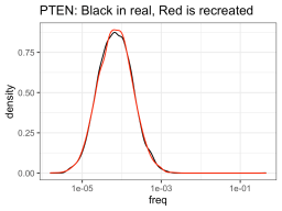
So I ran some function that told me what a hypothetical log-normal distribution fitted to the real data was (I’m glossing over this part for today), and apparently the NUDT15 library log-normal mean was -8.92 and log-normal sd was 0.71. On the other hand, the PTEN library log-normal distribution had a mean of -9.58 and sd of 0.99. So using those numbers, one could create NUDT15 or PTEN library-esque distributions of variants of whatever sizes you want (presumably the size of your library). But in this case, I created fake PTEN and NUDT15 datasets, so I can see how good the approximation is compared to the real data.

So it definitely had much more trouble trying to approximate the NUDT15 library, but eh, it will have to do. The PTEN library is spot on though. Anyway, using those fake approximations of the distributions allows us to sample from that distribution, n number of times, with n being one from a bunch of cell numbers that you could consider recombining. So like, one-hundred thousand, quarter million, etc. Then you can see how many members of the library was successfully recombined (in silico).

Well, so the fake NUDT15 library actually performed much worse out of the gate (as compared to the real data), but evened out over increased numbers. PTEN had the opposite happen, where the fake data did better than the real data, though this evened out over increased numbers too (like 1e5). But to be honest, I think the more realistic numbers are all pretty similar (ie. If you’re thinking of recombining a library of ~5,000 members into 10,000 cells, then you are nuts).

So based on this graph, what would I say is the minimum number of recombined cells allowed? Probably something like 300k. Though really, I’d definitely plan to get a million recombinants, and just know that if something goes wrong somewhere that it won’t put the number below a crucial region of sampling. Well, libraries of approximately 5,000 variants, and a million recombinants. I guess I’m recommending something like 100 to 200 -fold coverage. Damn, way to undercut this whole post. Or did I?

BTW, I’ve posted the code and data to recreate all of this at https://github.com/MatreyekLab/Simulating_library_sampling

Also, I dug up old code and tried to modify / update it for this post, but something could have gotten lost along the way, so there may be sone errors. If anyone points out some major ones, I’ll make the corresponding fix. If they’re minor, I’ll likely just leave it alone.

Split mCherry

I had a product that could have benefitted from using split mCherry to serve an AND function. Put the split mCherry in my usual mCherry spot in the recombination vector (2A’d with Puromycin, also), and I couldn’t see any visible fluorescence when both the small and big fragments were in the same cell. After some time, I saw a paper using split super-folder mCherry fused with the Spycatcher system, so I used that and that seemed to allow us to now see a shift in fluorescence off the background. I found another paper using an improved split super-folder mCherry (sfmCherry3C), and tested that, which seemed to work slightly better.

So while not perfect, in that there isn’t *complete* separation from the background distribution, it’s shifted away enough that it should serve my purposes (for now). Though, well, I’ll probably keep playing around with this (perhaps adding something like a leucine zipper?) and seeing if that helps increase fluorescence.

Identity matrix of indices used in the lab

We’ll be doing a lot of multiplex amplicon-based Illumina sequencing, which means we’ll eventually have a lot of different indices (I think some people refer to these as barcodes) used to multiplex the samples. I’m doing everything as 10 nt indices, so theoretically there is 4^10 or slightly over one million unique nucleotide combinations that could be made with an index of that length. I don’t intend of having anywhere close to 1 million different primers, so I think we’re pretty safe.

That said, I’d like to ensure our indices are of sufficient distance away from each other such that erroneous reads don’t result in switching of one index for another. Anh has come up with a way that we can make sure our randomly generated indices don’t overlap with previous indices, but still useful for me to keep track and make sure things are running smoothly. Thus, I generated an identity matrix of all of the indices we have in the lab right now.

In a sense, the diagonal is a perfect match, and serves as a good positive control for the ability to see what close matches look like. By eye, the closest matches between any two unique indices seem to be 70% identity, which I can live with.

Dual index on Miseq and Nextseq

We’re planning on submitting some dual indexed, paired read, amplicon sequencing samples, and depending on how many we have, we may submit for sequencing on a Miseq or Nextseq. Since this is all custom (and we generated the indices), I had to figure out how exactly how the process plays out for the two instruments to see what we need to the sample sheet for demultiplexing. I figure I’d illustrate it out for people in the lab so they understand the process as well.

The common steps

Everything starts with bridge amplification, where both the forward and reverse strands are physically bound to the flow cell by their 5′ ends. I’m denote where the DNA strands are physically bound to the flow cell with the grey circles on the ends.

Next is denaturing the strands so they are no longer bound, and also cleaving the strand that is bound to the flow cell via the p5 sequence. The result is something that looks like this.

Now the single stranded molecule is ready for sequencing from the read 1 primer. The light blue box is showing the nucleotides we’ll be reading in this particular library.

Once that read is done, next is reading the first index.

The dissimilar steps

We didn’t do a ton of dual indexing of the libraries in my postdoc (and since Jason used to run all of the kits anyway), I didn’t really need to know these steps, but I’ve had to figure them out now setting everything up in my own lab. I’ll go over what happens with the Nextseq first, since that’s conceptually a bit easier. Here’s what the Illumina docs say.

The Nextseq way

So this setup allows for dual indexing read off of two custom primers. So for this specific library, this means that the complementary sequence is going to be synthesized, making a double-stranded bridged molecule again.

And then after everything is denatured and the original template strand removed (presumably by cleaving at the p7 sequence this time), the second index can now be sequenced.

Followed by sequencing of the second read.

The Miseq way

Looking at what Illumina says in their documents for dual indexing on the Miseq, it looks a little different:

So the clear difference here is that the second index for the Miseq system is without a second custom index seq primer, but instead *during* the second strand synthesis step primed by the p5 oligo. With our specific library, it will look like this, starting with sequencing of that second index:

Note: I didn’t realize this until we did the exercise, but the p5 cluster generator we used to use in the Fowler lab is longer than the actual p5 sequence Illumina gives in their manuals. Not quite sure for this discrepancy, though I’m assuming that may mean that the sequences immediately after the p5 oligo during this step won’t be our rather variable index sequences, and instead may be some constant bases preceding the indexes. I’m guessing this is not a deal-killer, but something we’ll still have to be cognizant of when determining the run programming.

After that, is the complete second strand synthesis, resulting in a double stranded bridged molecule again.

Followed by denaturing and cleavage (again, presumably of p7 sequence) as described above, followed by annealing of the read2 primer.

So why does this matter?

Well, I think the practical implications are a few-fold. Firstly, Miseq dual indexing won’t need that second custom index read primer, since it will be reading off of the p5 sequence. And this is further complicated by the fact that the p5 adapter sequence we added onto the amplicons may perhaps be a bit longer than what’s actually on the chip, so we may have to factor this into the run parameters. Secondly, the strand that is reading that second index is different. With the Miseq, it’s being read off that first strand and thus in the same orientation as index 1. On the Nextseq, it’s being read on the second strand, so it will be read in the opposite order as index 1. Thus, I think this matters in terms of whether we’re putting the forward or reverse complement in the sample sheet, which will differ depending on whether we’re going Miseq or Nextseq with these samples.

First paper from the lab published!

The first paper from our lab is now out in PLOS Pathogens! We created a panel of ACE2 variant cells and found that (pseudo)viruses with SARS-CoV spike, or the WT or N501Y SARS-CoV-2 spikes, differentially use the ACE2 protein surface during entry. This was a team effort, with Nidhi and Sarah on pseudotyped virus assays and molecular cloning, with Anna and Vini performing the BSL3 SARS-CoV-2 work. Great job, everyone!